
Icons

Icon Style 1
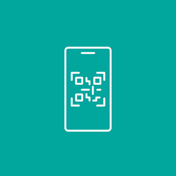
The Icon Style 1 references the simple line work in the Smart-ID logo and has become an important brand asset. It is used as a supporting element in combination with titles, blocks of copy and photography.
Simple, tasteful fine line drawings for various comms channels and information visualisation. Icons is created based on the 5pt line weights and visual complexity of the given pictograms.






Lejupielādēt
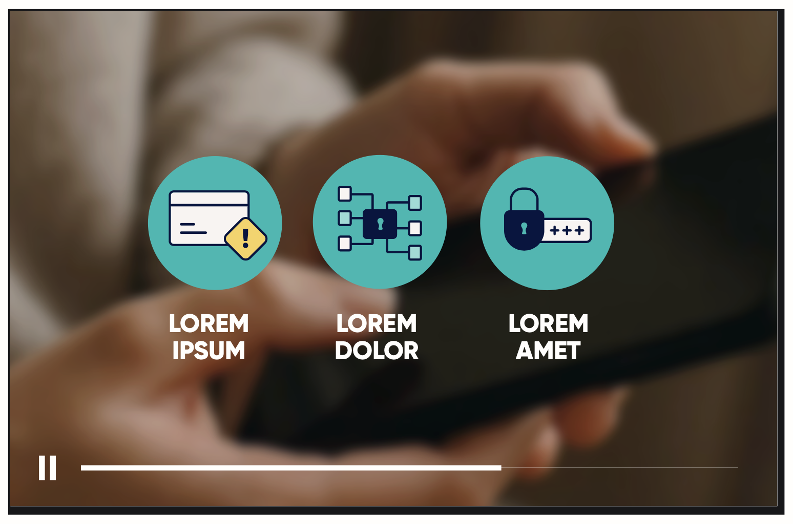
Icon Style 2
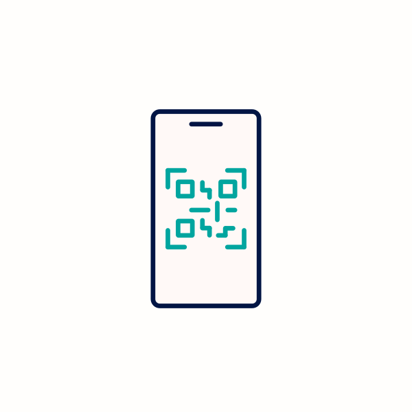
The Icon Style 2 has added depth and stronger communication cues with colour. These can be used when the visual element needs to play a more significant role in communicating, carries more informative weight and takes up more space than the copy.
The primary fine line drawings with colour adding depth and stronger communication cues create the secondary set of pictograms for when more active and visually enganging are needed.
Pictograms should always prioritise the core colours and use the additional Warning Red and Affirmative Blue where relevant.





Lejupielādēt
