Logo usage
On backgrounds
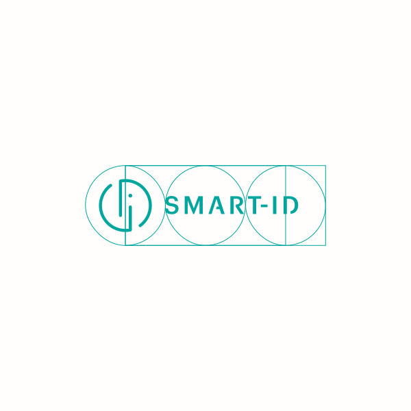
To ensure a consistent and recognizable brand identity, the logo should always be used in accordance with the established usage guidelines. Whenever possible, give preference to the primary logo.
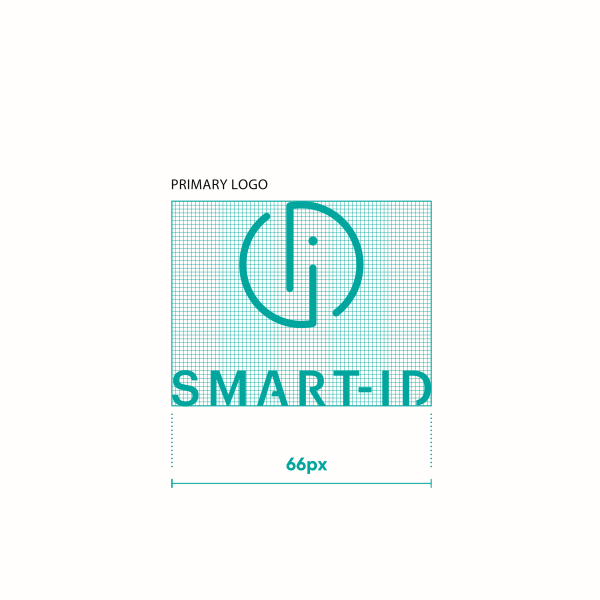
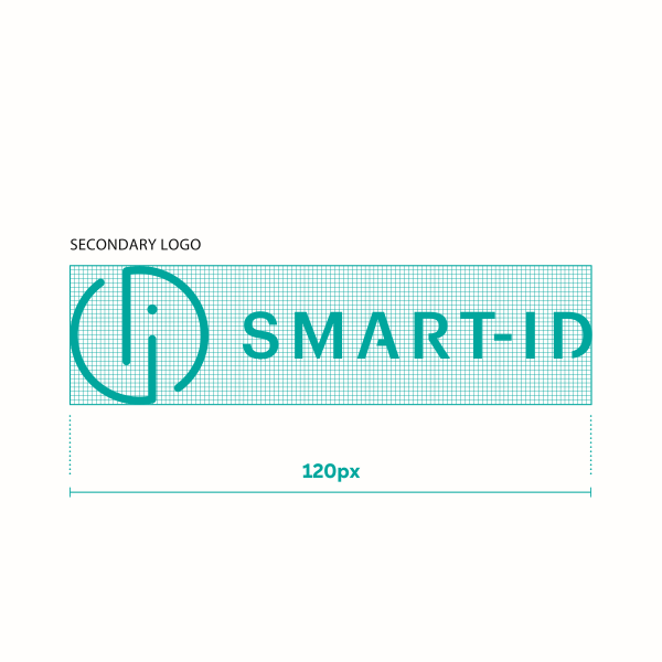
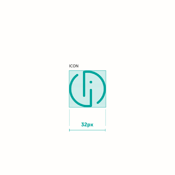
Minimum size for digital
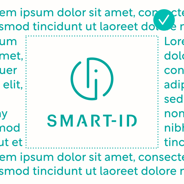
To ensure legibility the logos may never appear smaller than the sizes marked for each logo. Brand icon without the wordmark is only to be used for the app icon & web favicons.
NB! The logos displayed here are bigger than their marked sizes to show the pixel grid.
Logo + SK ID Solutions
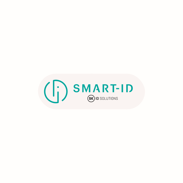
When the SK ID Solutions logo is of equal importance, match & lock up the logos as below
Primary logos
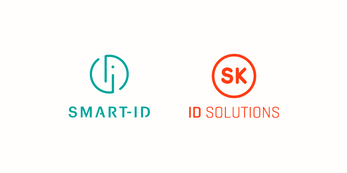
The top edge of the logo to line up, brand names to match eachothers type/x height .The space between the logos is the width of the Smart-ID icon
Secondary logos
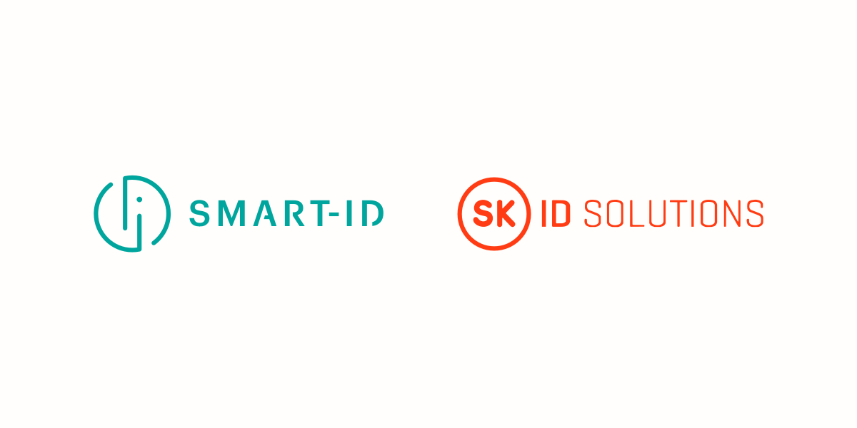
The wordmarks to match eachothers type/x height. The space between the logos is the width of the SK ID Solution icon
Brand name use
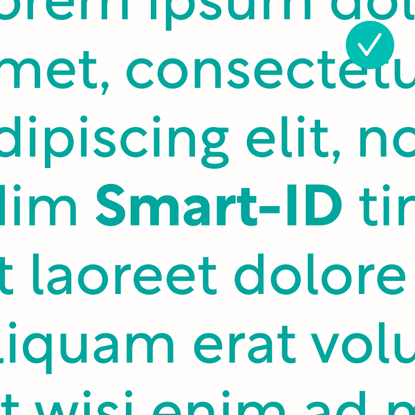
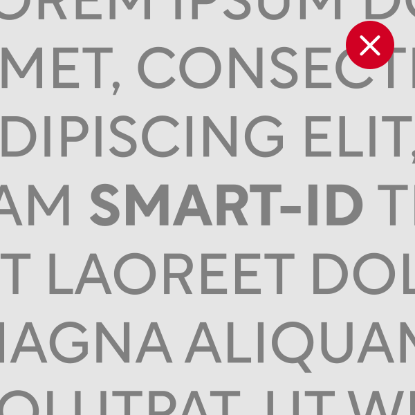
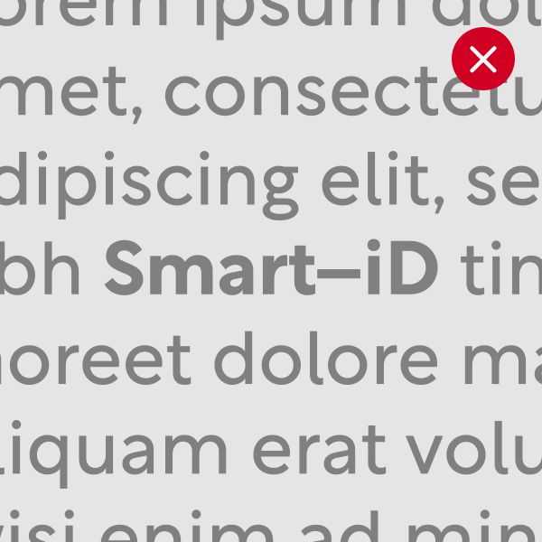
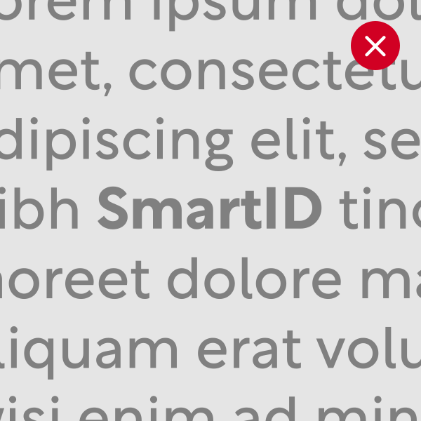
Brand name consistency across different channels and platforms in text plays an important role for user security.
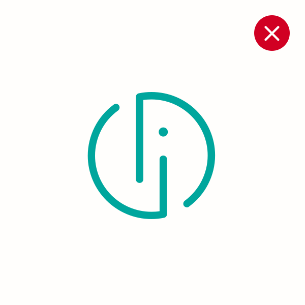
Incorrect logo use
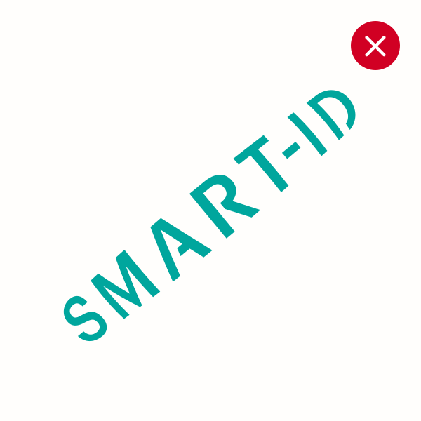
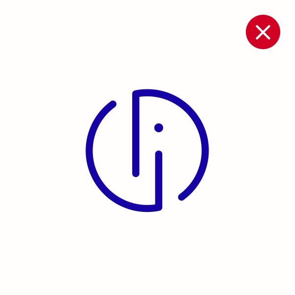
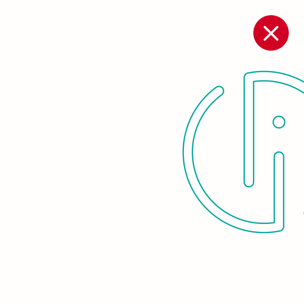
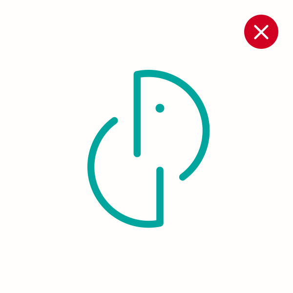
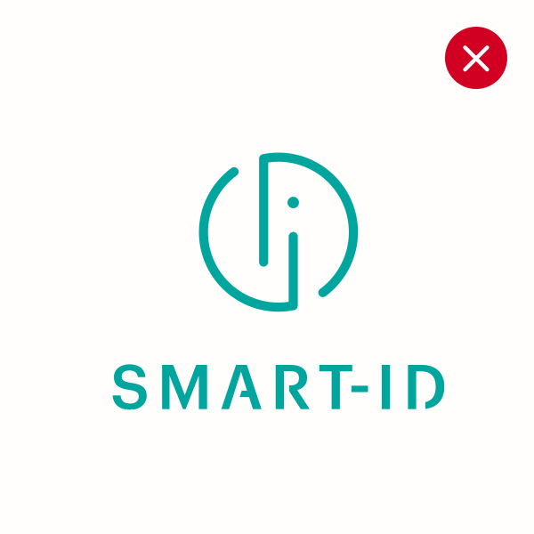
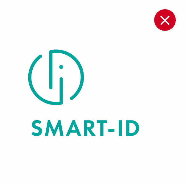
To protect the integrity and recognizability of the Smart-ID brand, the logo must never be altered or used in ways that deviate from the approved guidelines. The examples below illustrate the most common incorrect applications to avoid.

Logo placement
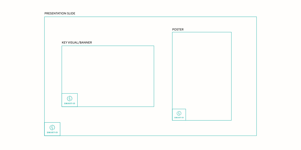
To encourage consistency, when the logo is just a supporting asset, place it at the bottom left corner of the visual (document page, banner presentation info slide, etc.).
Exceptions are allowed when it’s done purposefully and within reason – title pages/slides, video campaigns, social media visuals etc.